Start with the intended use
Decide whether the packets are for event handouts, corporate gifts or branded gift sets before choosing the base color, texture and finishes. Consider the paper together with the artwork, brand colors and how the envelope will be used.
| Paper direction | Features to consider | Uses to discuss |
|---|---|---|
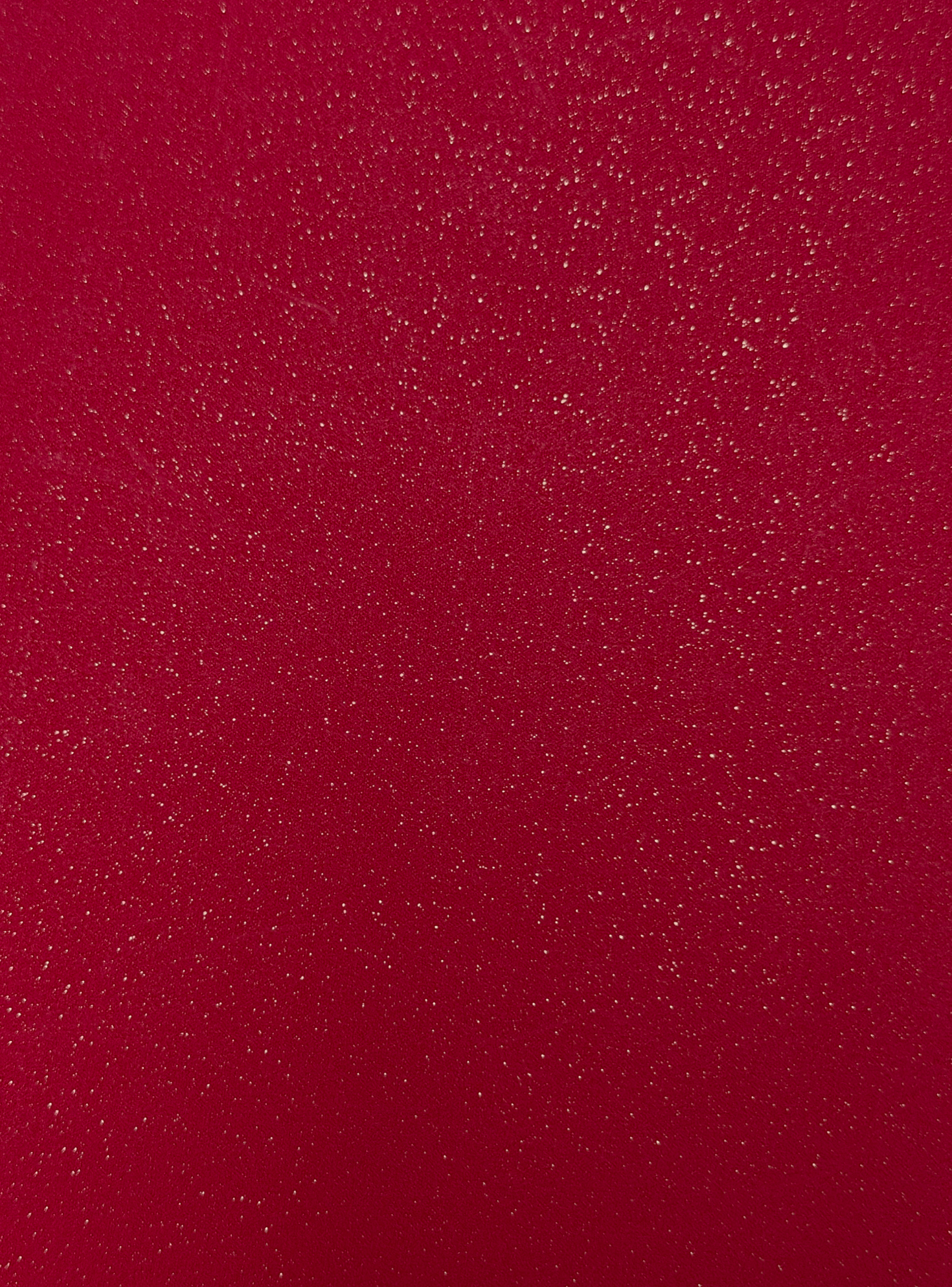
| Classic red papers | Color, stiffness and overall appearance | General customization, seasonal handouts, corporate gifts |
| Pearlescent papers | Surface sheen and appearance under light | Gift-box sets and branded gifts |
| Specialty textures | Feel, texture and interaction with artwork | Business gifts and brand editions |
Weight is only one factor
Paper weights shown on the website are reference labels and should be confirmed for the selected specification. Weight alone does not establish thickness, compatibility with a finish or a premium feel. Consider paper construction, surface treatment and the folded envelope too.
Ask for the relevant paper details and clarify whether you need a paper reference or physical sample before approval.
Consider paper and finishing together
For metallic emphasis on a logo, discuss foil stamping. For detailed colored artwork, explore color printing. For a glossy contrast against the base surface, see spot UV. Compatibility still needs to be confirmed for the chosen paper and design.
Record the agreed specification
Record the paper name or agreed sample reference, color, reference weight and required print and finishing details. Screen images help narrow the direction; assess actual color and texture with the agreed paper or finished sample.
Once you have a direction, use the quotation checklist to confirm quantity, dimensions and delivery needs.